So, why the new look?
Our current branding has been going strong for almost two decades. Celebrating our 20th birthday last year provided a great opportunity to give a fresh feel to the whole APOPO brand. Don’t get us wrong, we loved our old logo and know many feel the same. That said, we believe the new look better matches what we’ve become today.
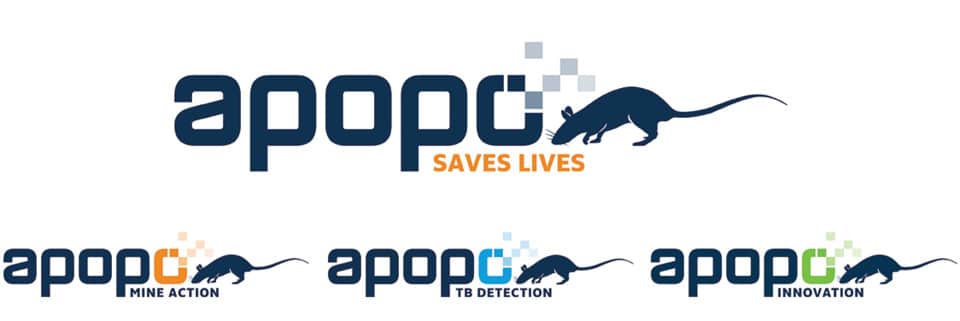
In general, the best logos are those that are versatile and adaptable. Over the last two decades we’ve developed quite a lot: we expanded into several new countries and grew our Training and R&D into a department in its own right. As with any logo, we wanted it to concisely convey everything that our organization stands for and be able to work in different contexts.
Our graphic designer worked to find something that appears crisp, innovative, and contemporary, and still reflects the APOPO spirit and family. It can be used with or without the rat and will represent our three main departments: mine action, tuberculosis detection and innovation.

We just wanted to take this opportunity to let you know about the change, so you won’t be too surprised when things look a little different.
Over the next few months, you’ll see the new look anywhere we’re out in public, like our website and social media; very soon you’ll see it on all of our products as well, aligning around this new direction.
It’s still us! With better representation for the different departments and hopefully a more coherent organization. We hope you like this new look and feel for APOPO.
